 WORK
ABOUT
EMAIL
WORK
ABOUT
EMAIL
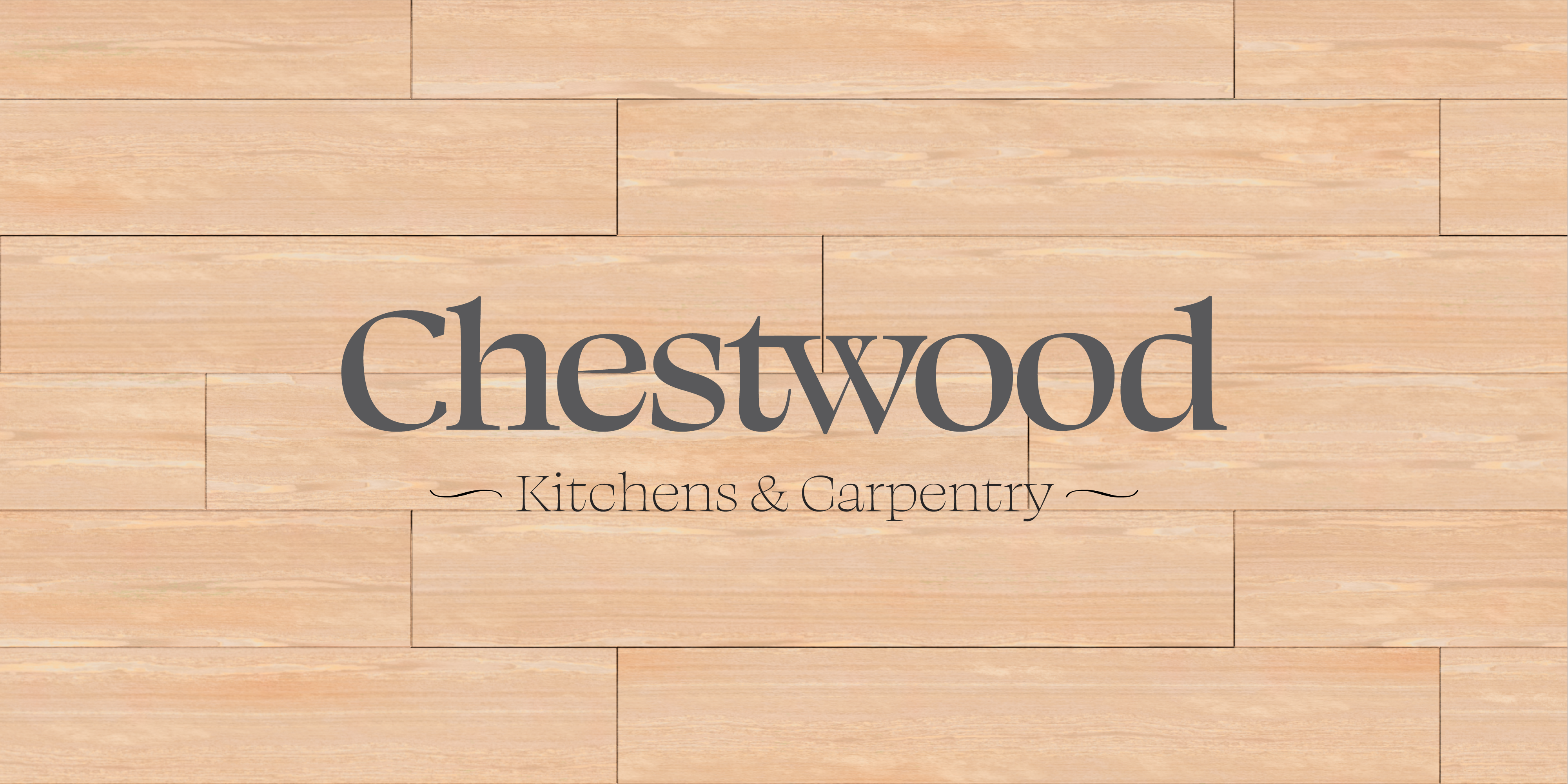
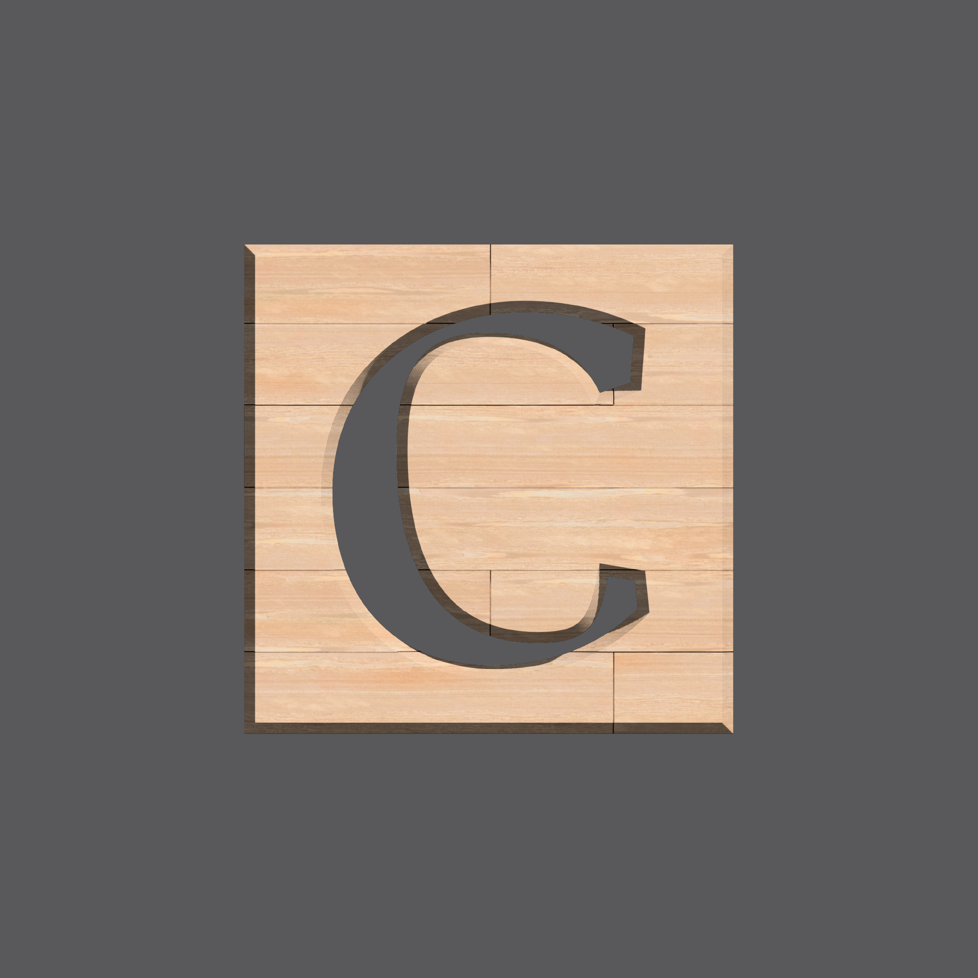
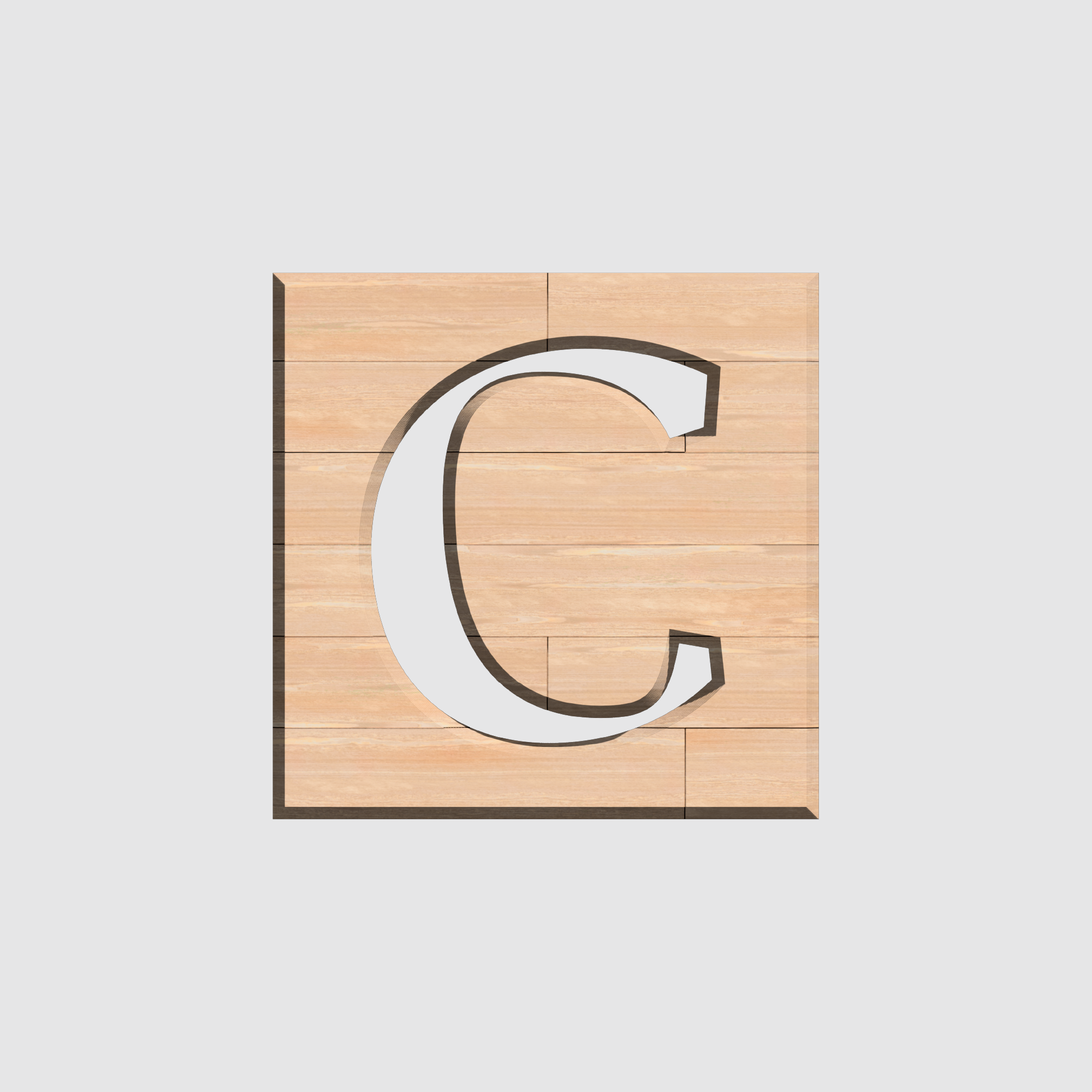
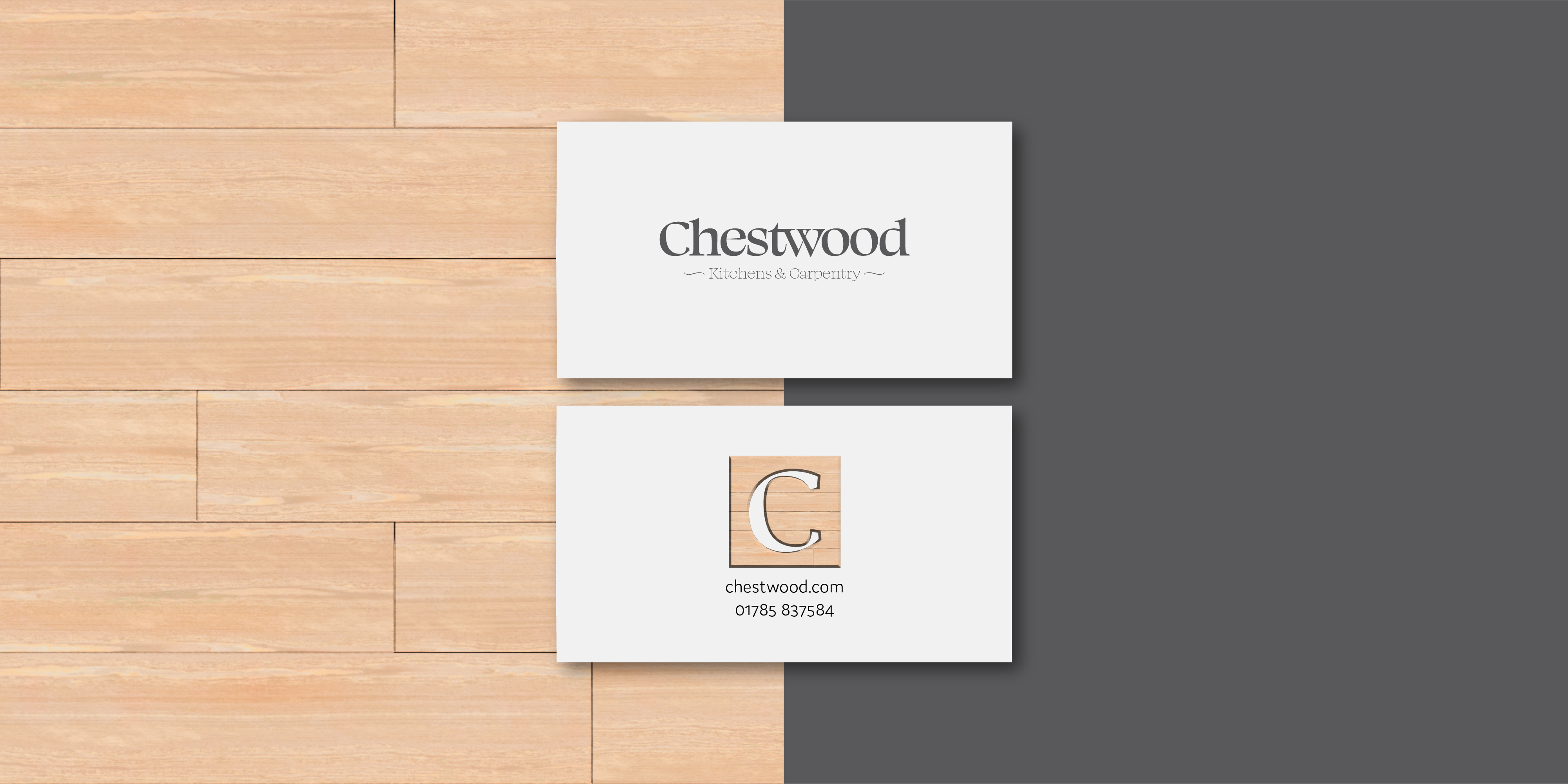
This project was created by myself after seeing a company of the same name on a business park and thought it could do with a bit of a spruce up. A sharper logo that kept the same style as previously, with a serif typeface that has an elegant form to give the impression of a bespoke and quality finish, to go along with the companies experience and tradition. Nothing too out there or too irrelevant.

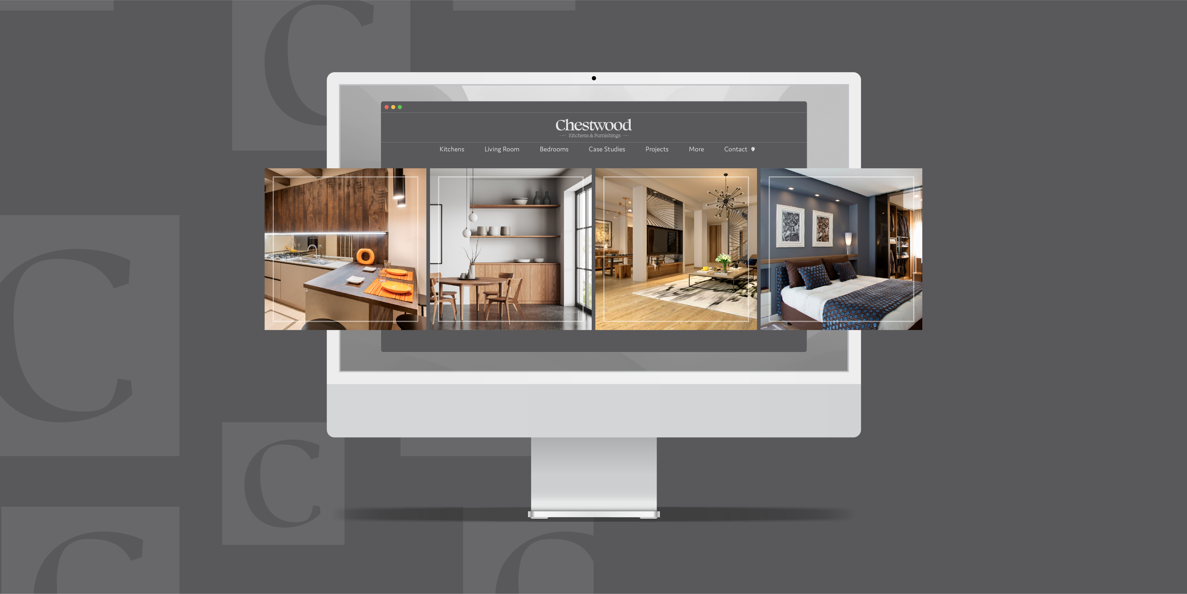
A website was something else that needed a revamp to bring the company a little more into the present day. With a sleek and minimal experience that enhanced the companies workmanship in all its glory to the potential client viewing it.
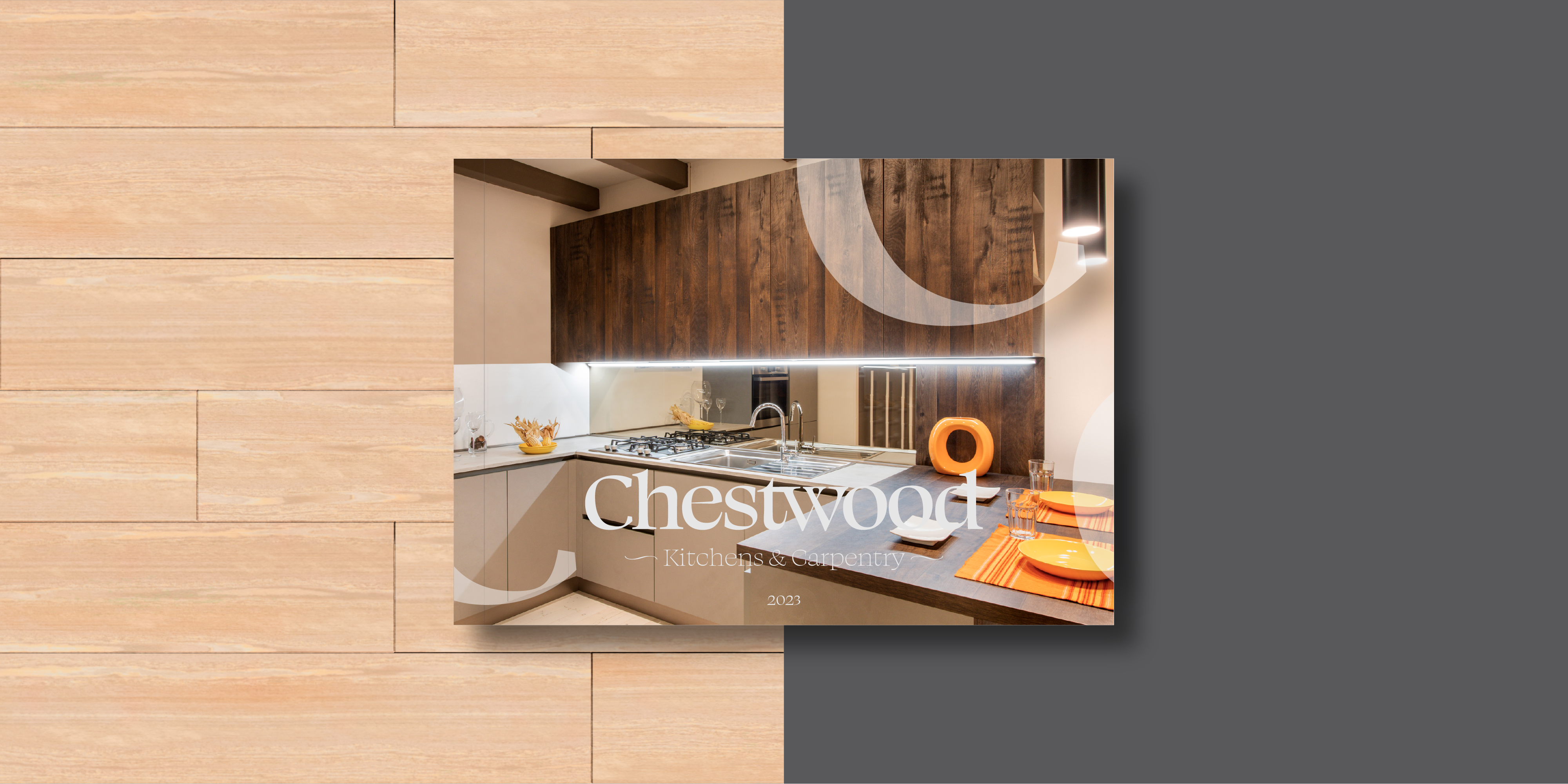
I also designed a brochure to show off their experience and workmanship. A company that needed to break into the modern market of carpentry whilst still upholding their values as a traditional and quality assuring business.