 WORK
ABOUT
EMAIL
WORK
ABOUT
EMAIL
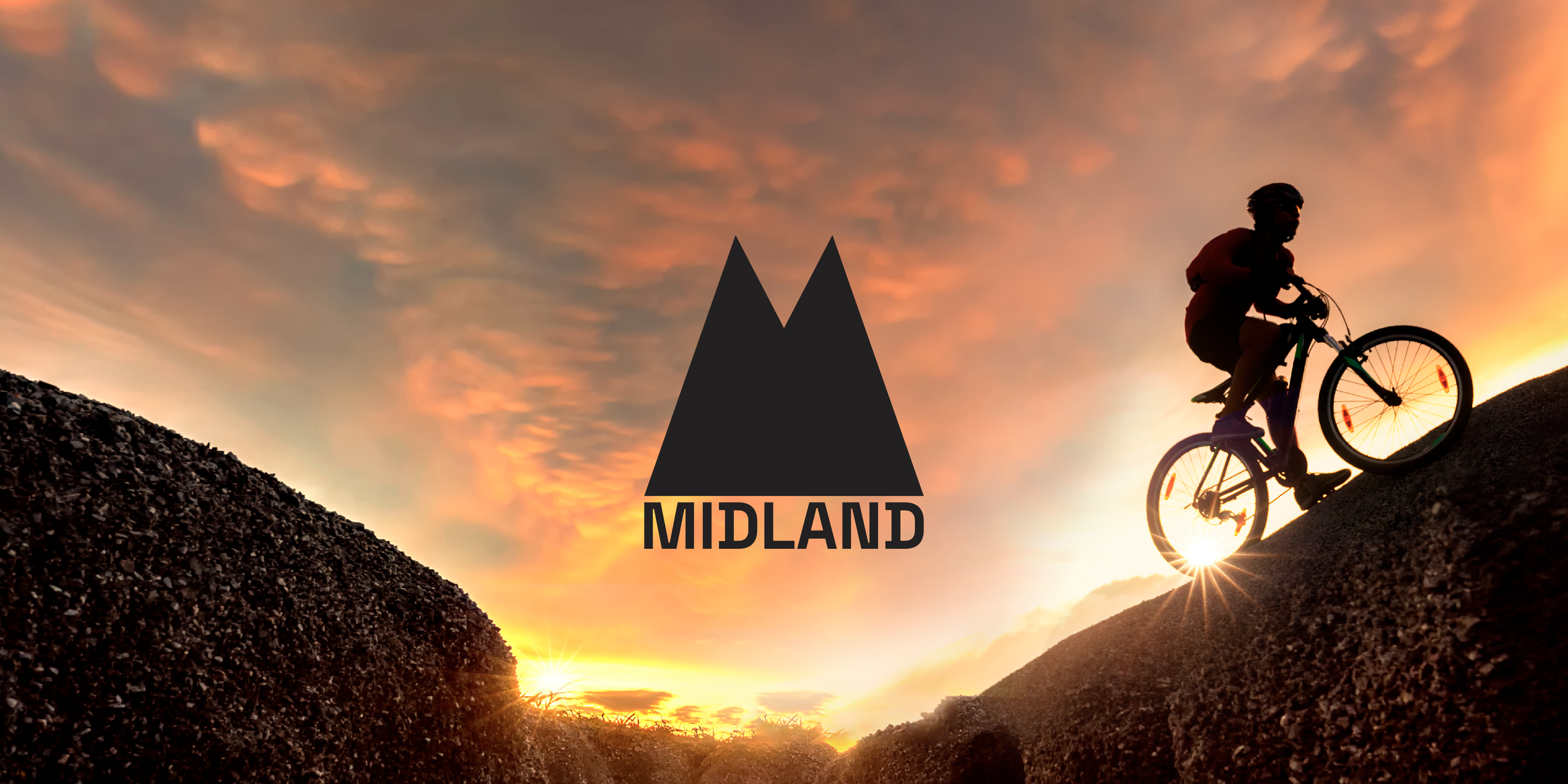
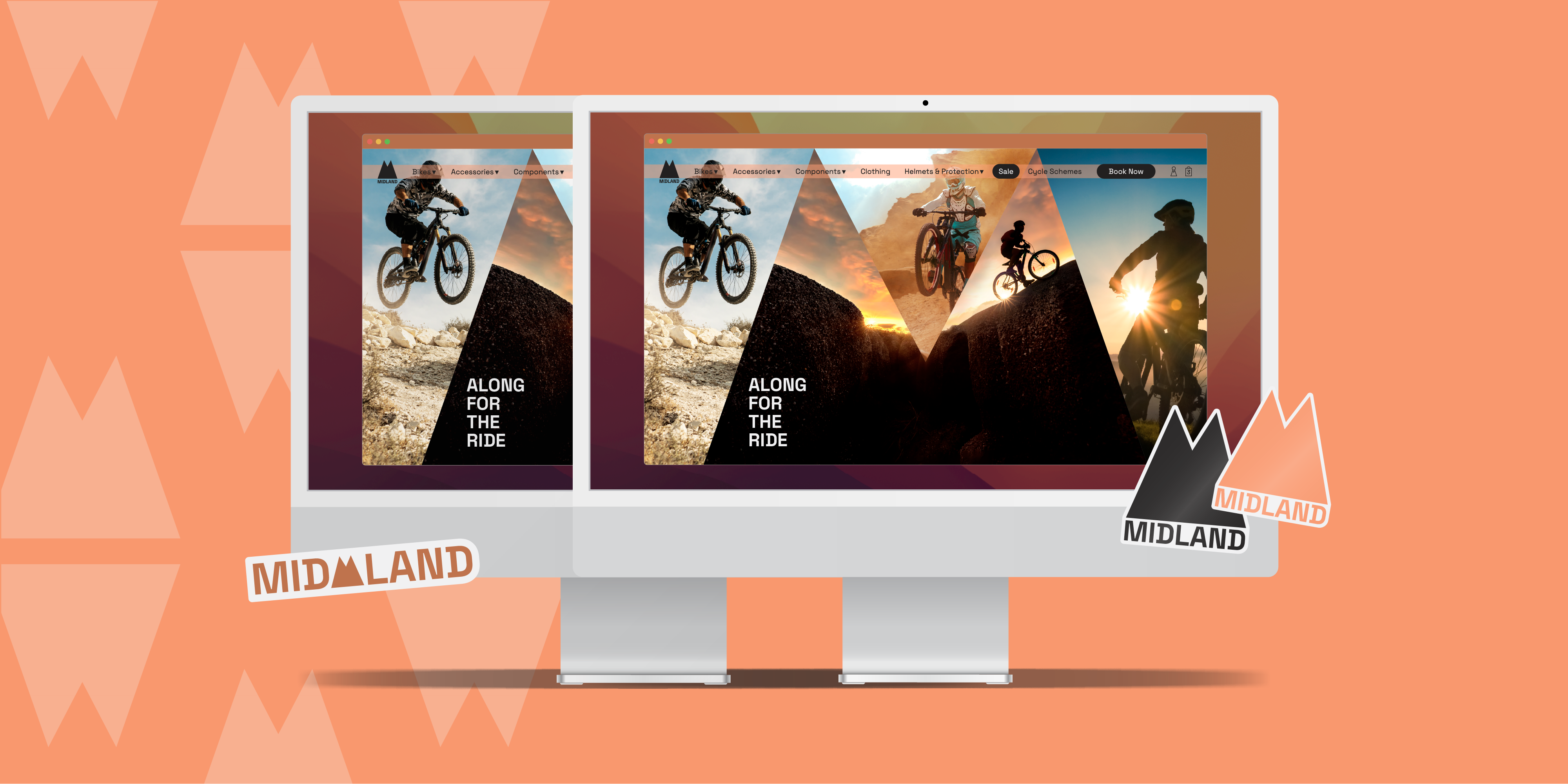
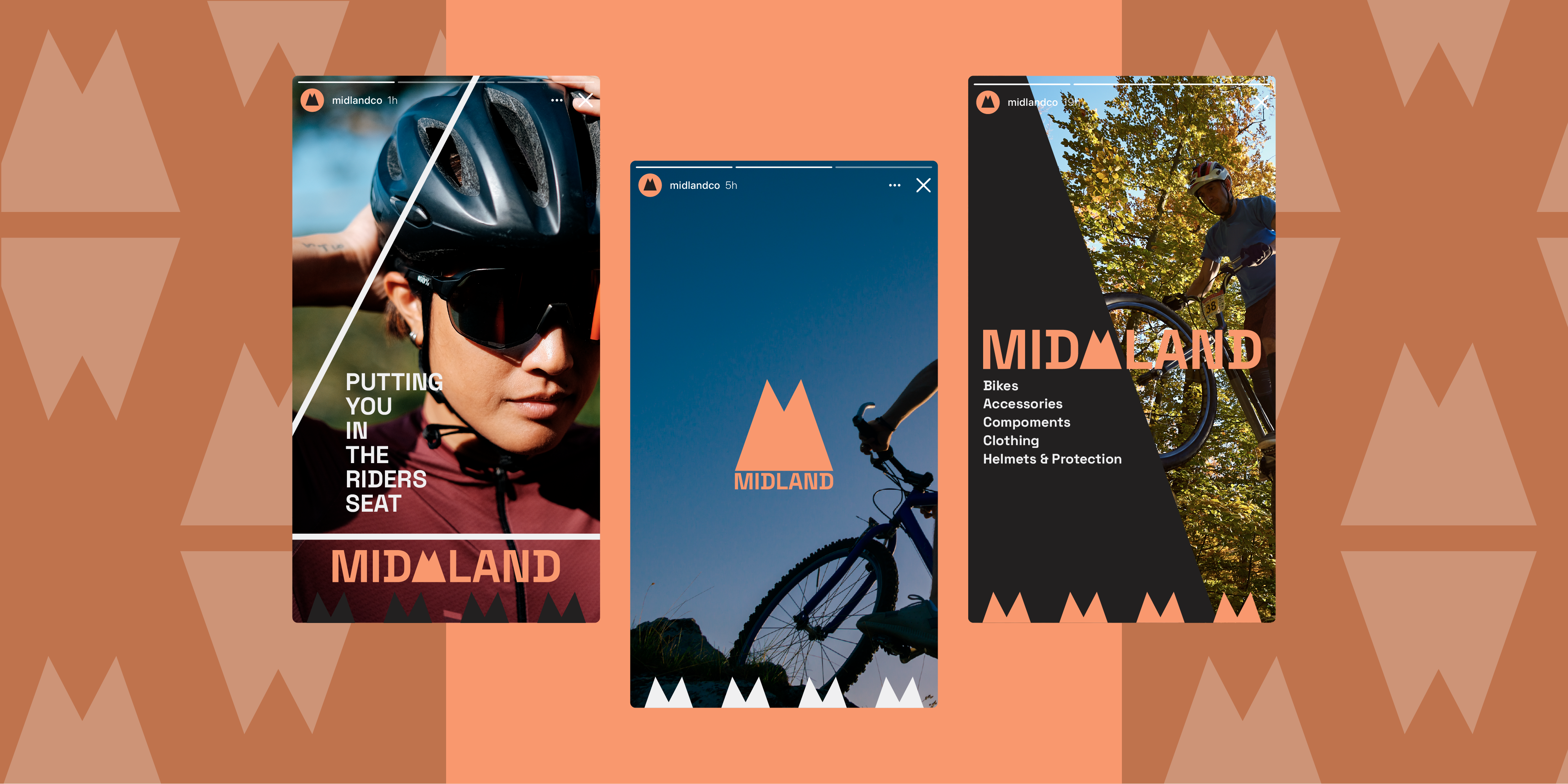
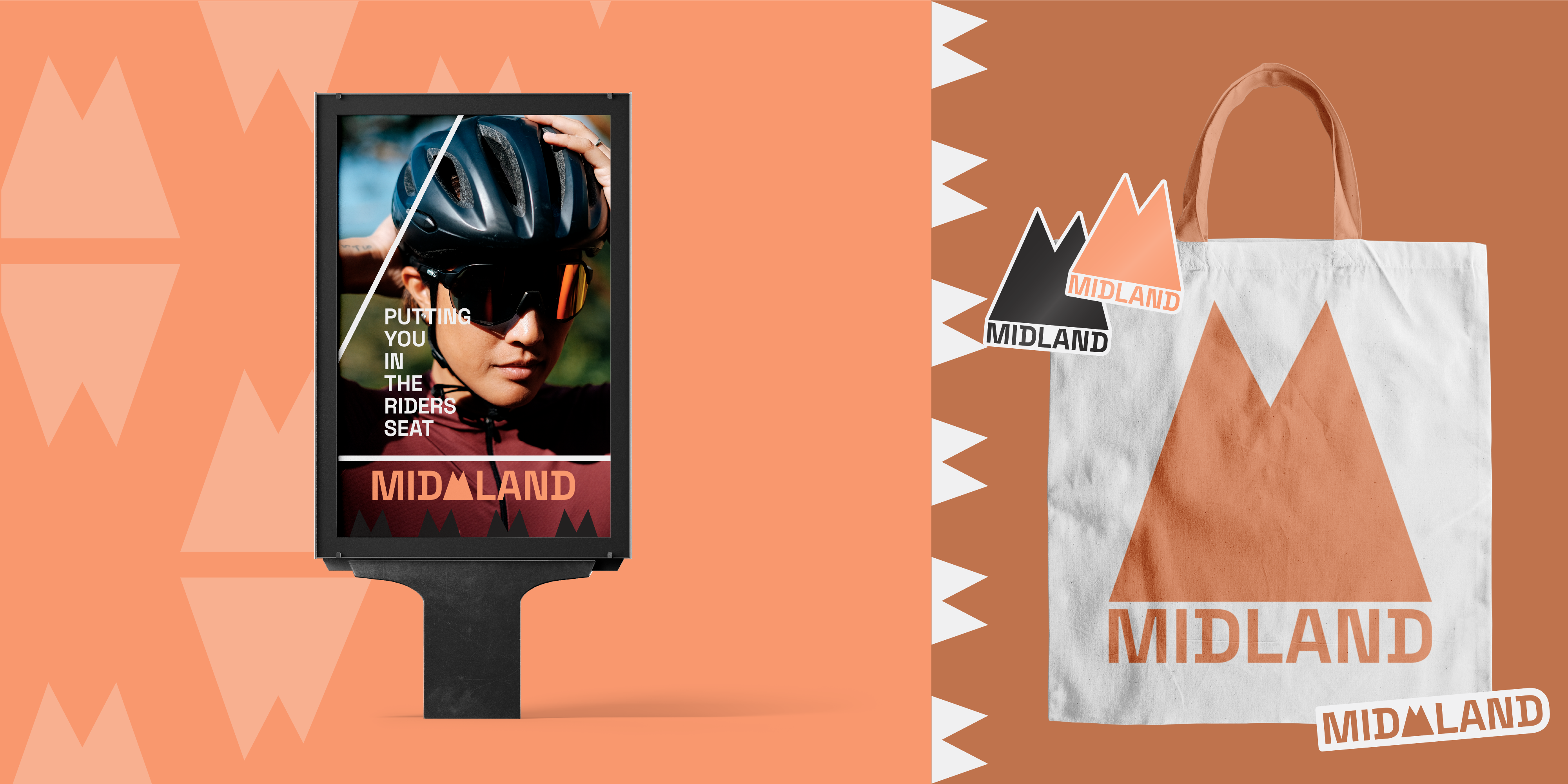
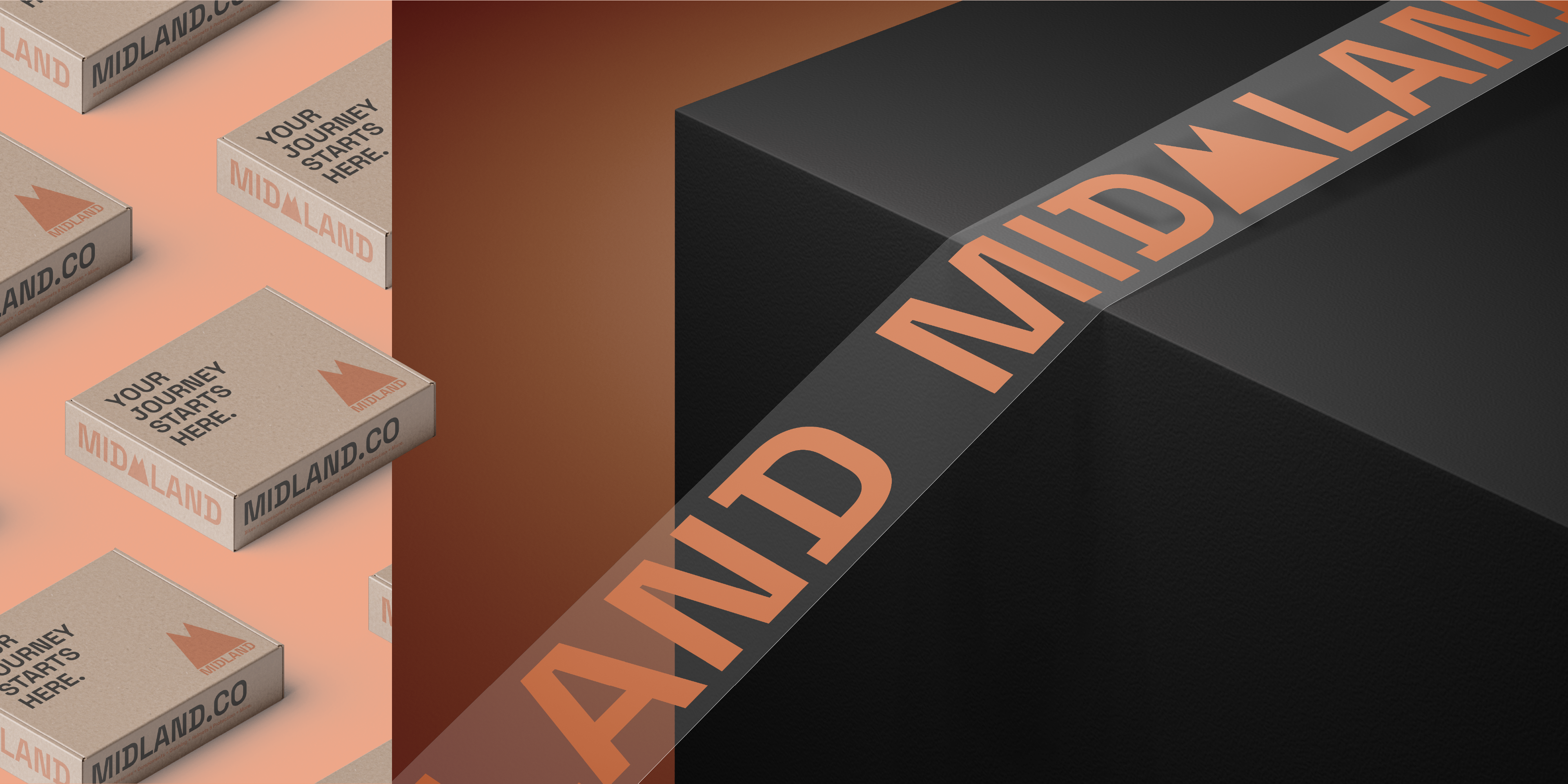
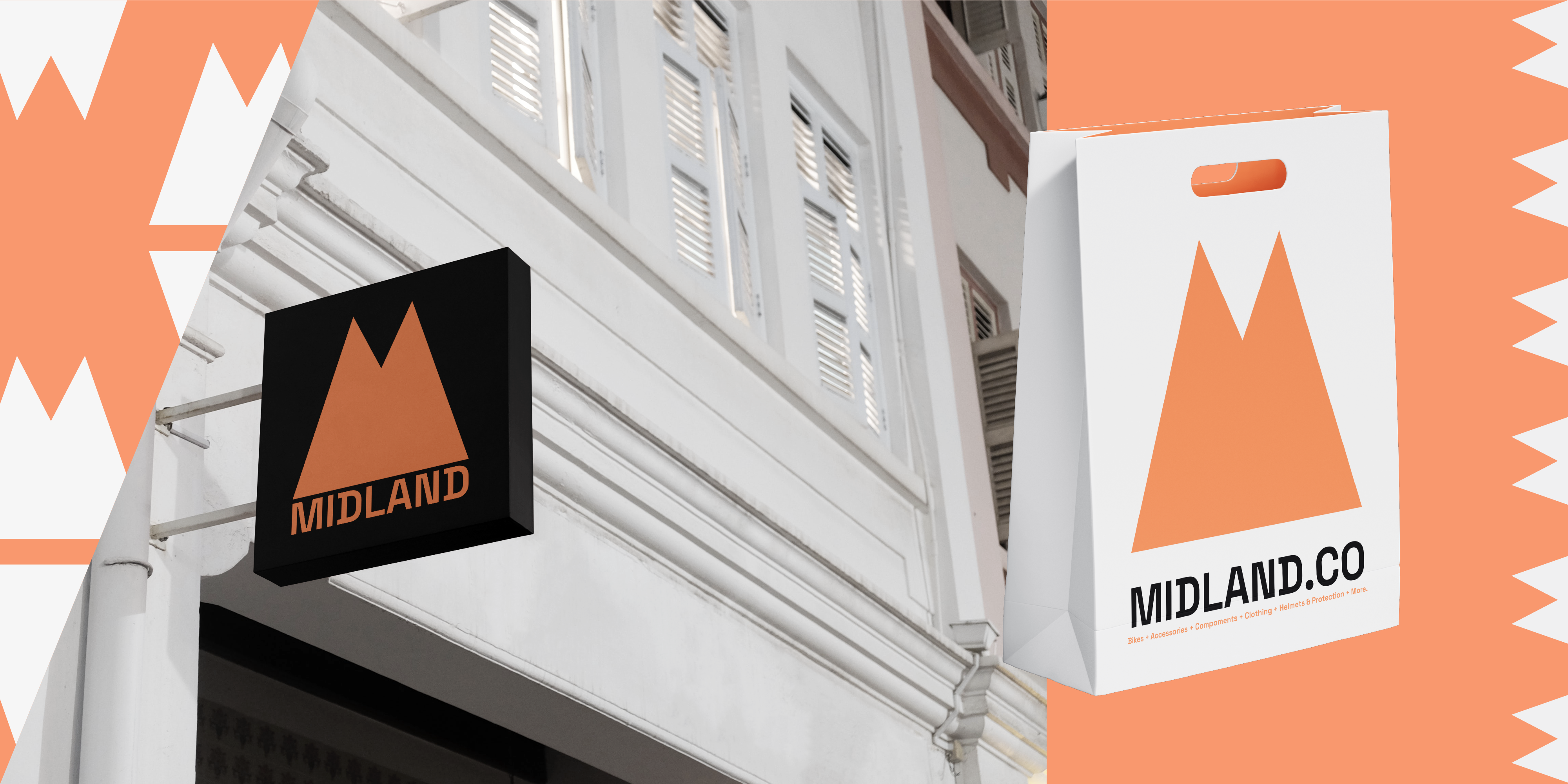
A bike shop with a main focus on mountain biking was in need of a modern and energising identity, with the desire to appeal to both male and female comsumers. A wordmark and an abstract logo that could be easily recognised, even when minimised, was created so that it could be applied to every function necessary. Such as social profiles, website logos and printed media.
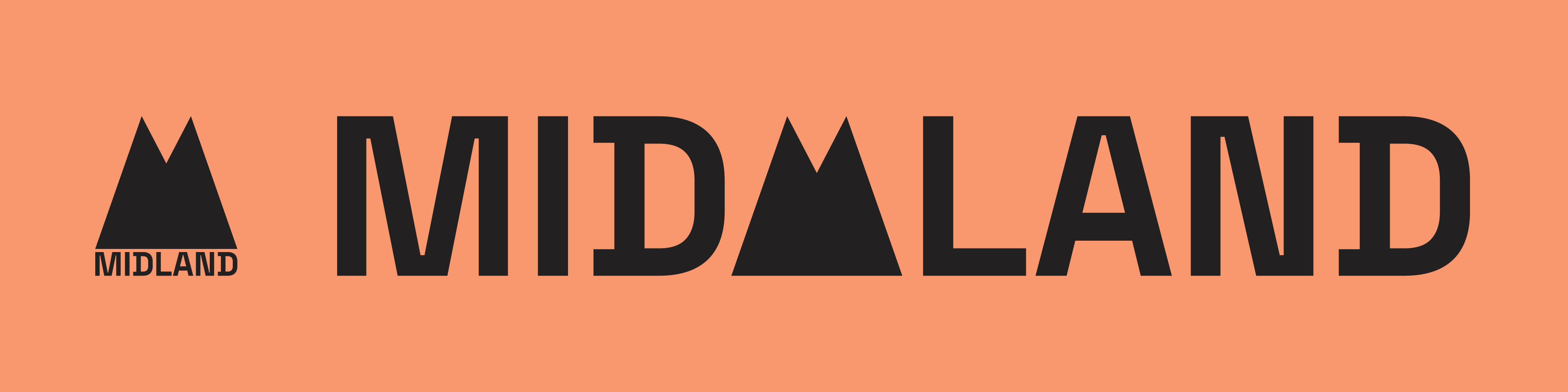

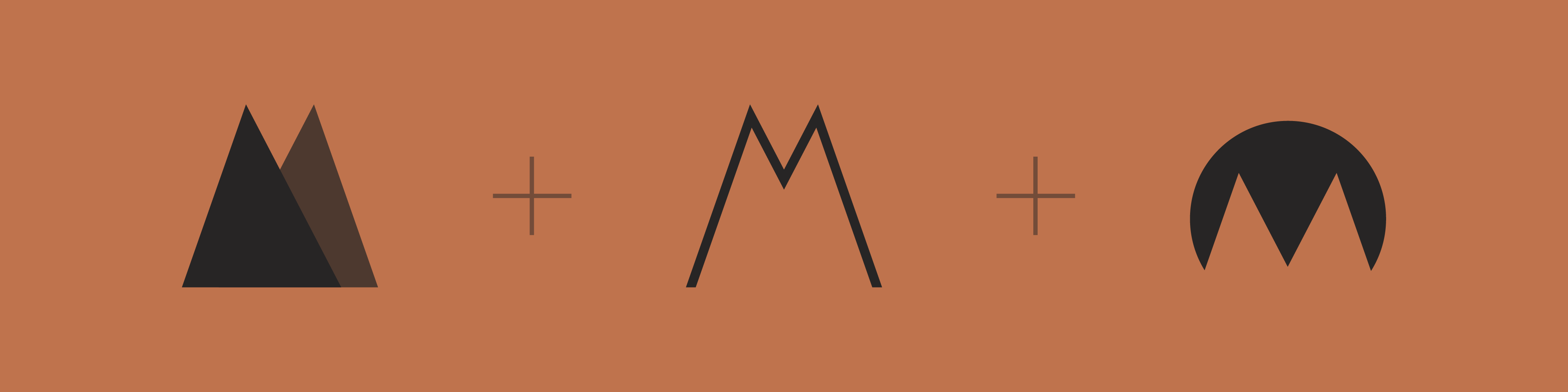
The abstract logo has three main resons behind its design. The first being that the shape is made up of two peaks or mountains. Refering to the main mountain biking element of the business.
The next part making up the logo is the letter 'M'. The two peaks from before merge together to create the letter that the comapny name begins with.
And thirdly the area where the two peaks meet is the middle ground or the midland.