 WORK
ABOUT
EMAIL
WORK
ABOUT
EMAIL
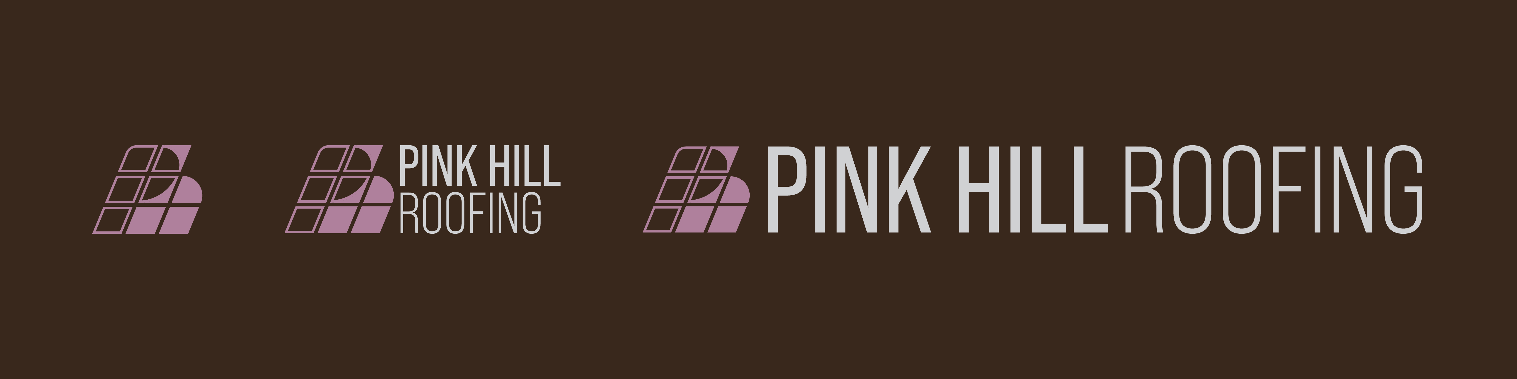
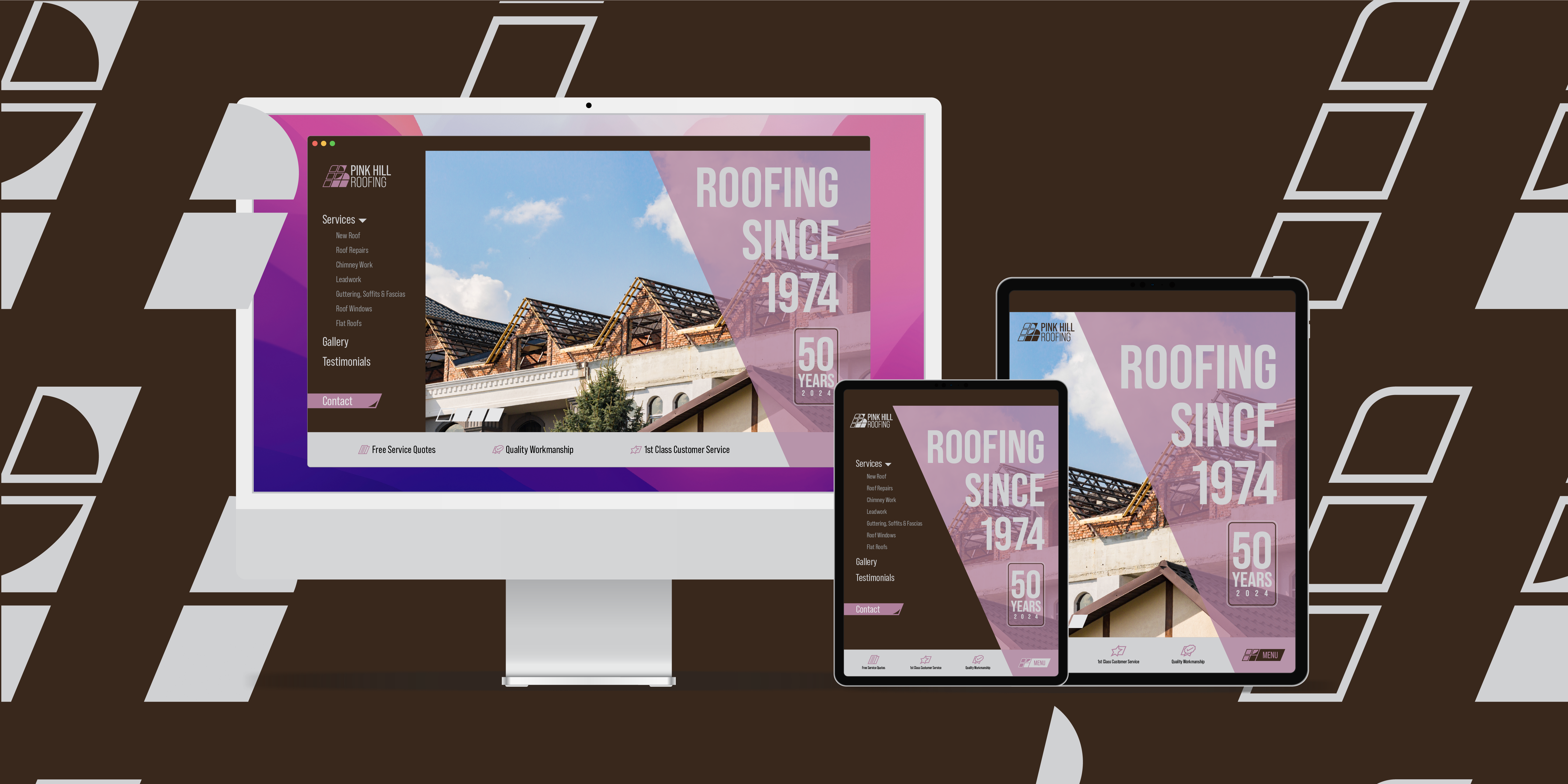
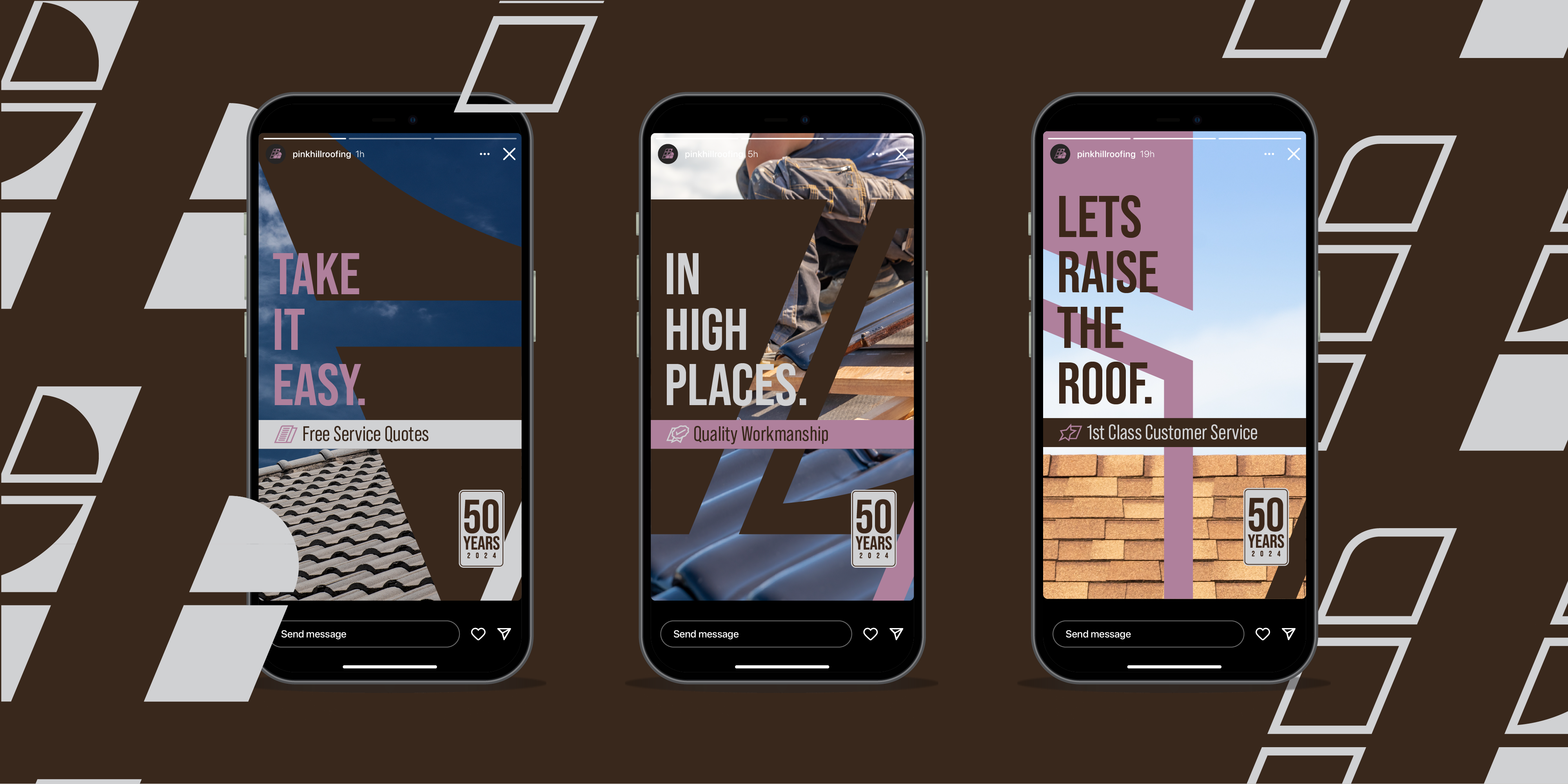
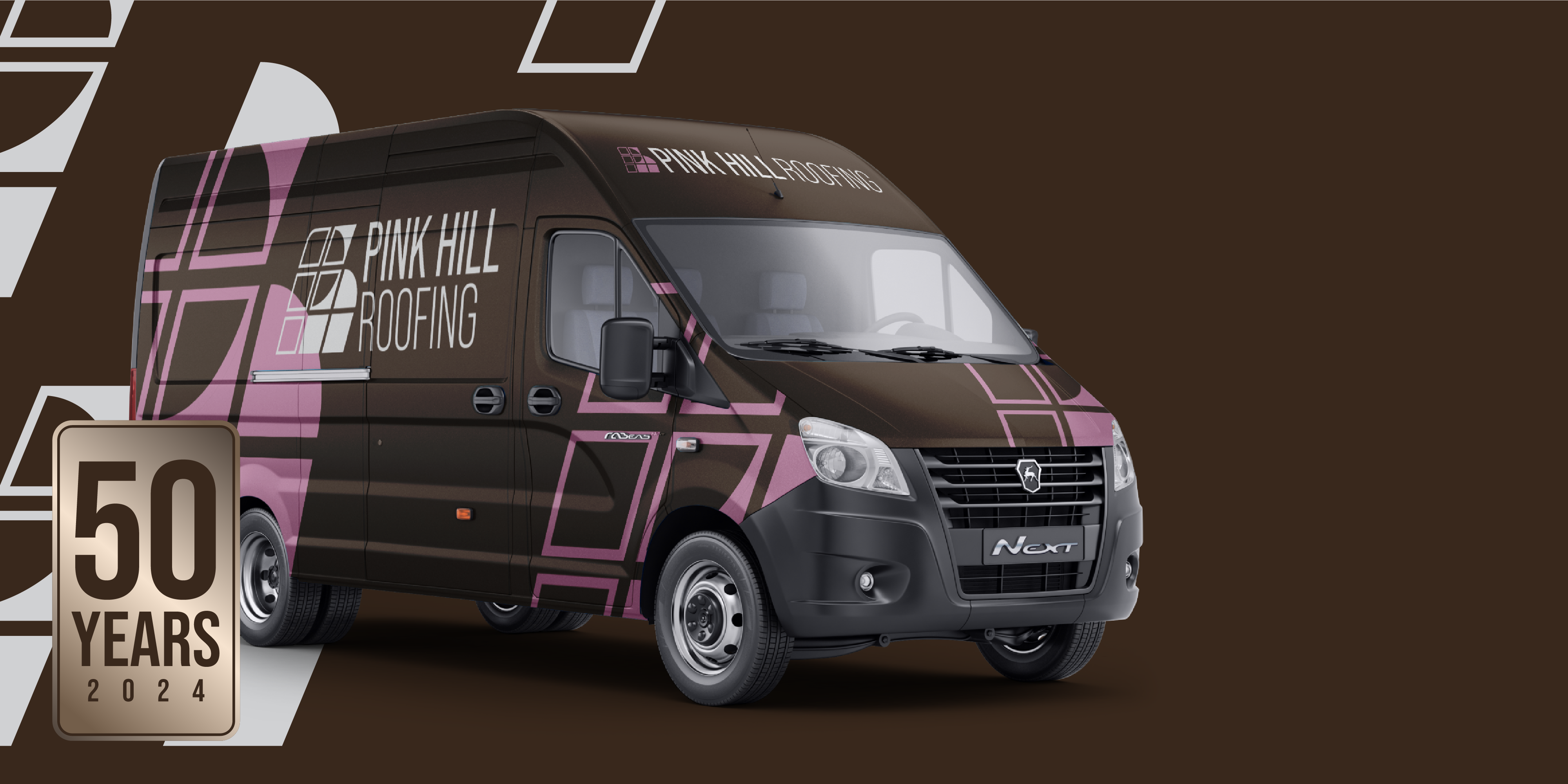
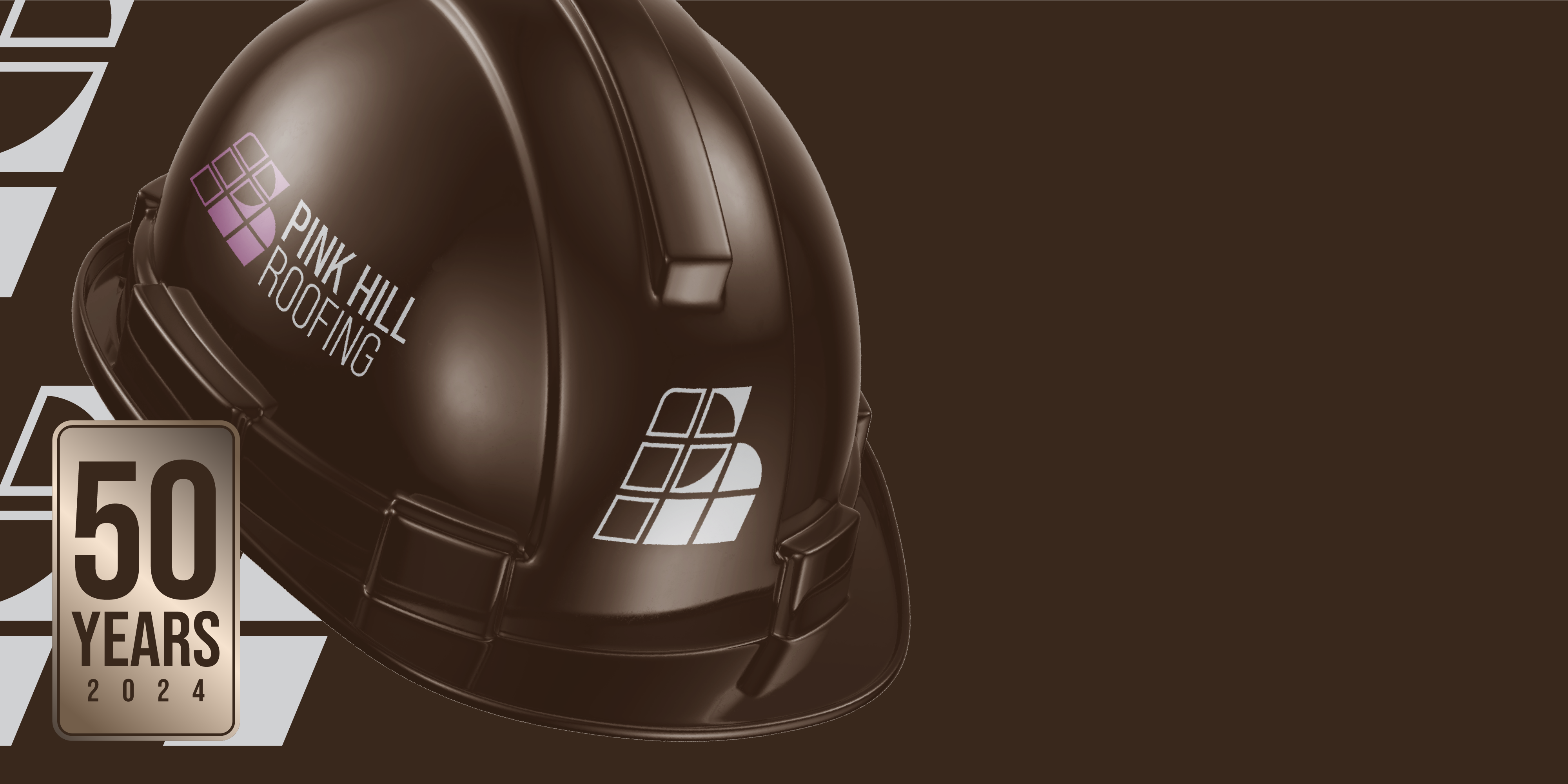
This brief designed by myself simply asked for an updated design throughout the companies brand. Bringing it in to the present day and off into the future for many more years to come. An identity that is modern, relevant and tasteful was needed to make this all happen. The brief asked for a logo that can be used independently and as a wordmark.
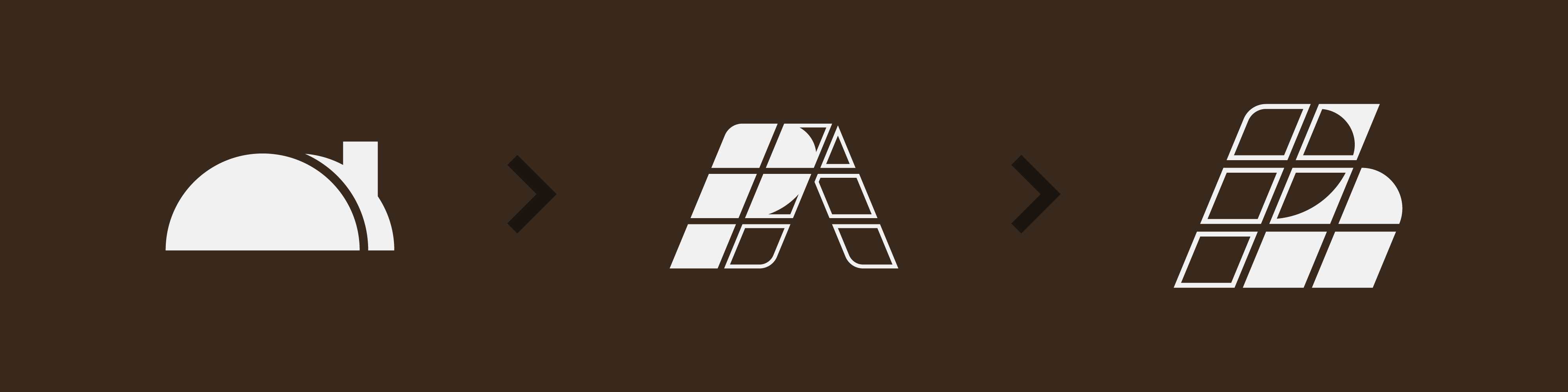
The first stage of this project was designing the logo. A combination logo that can be used as just a pictorial mark as well. The first design features a hill that also appears as a roof, with a chimney making that clearer and a 3D effect to make it pop and stand out more that a totally flat design.
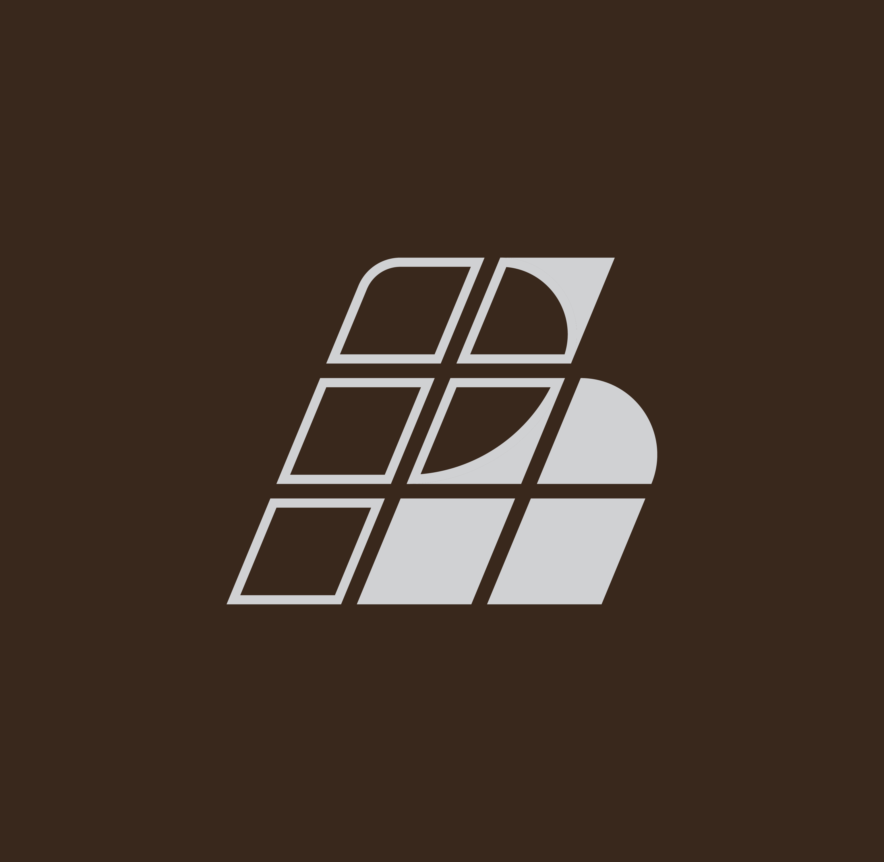
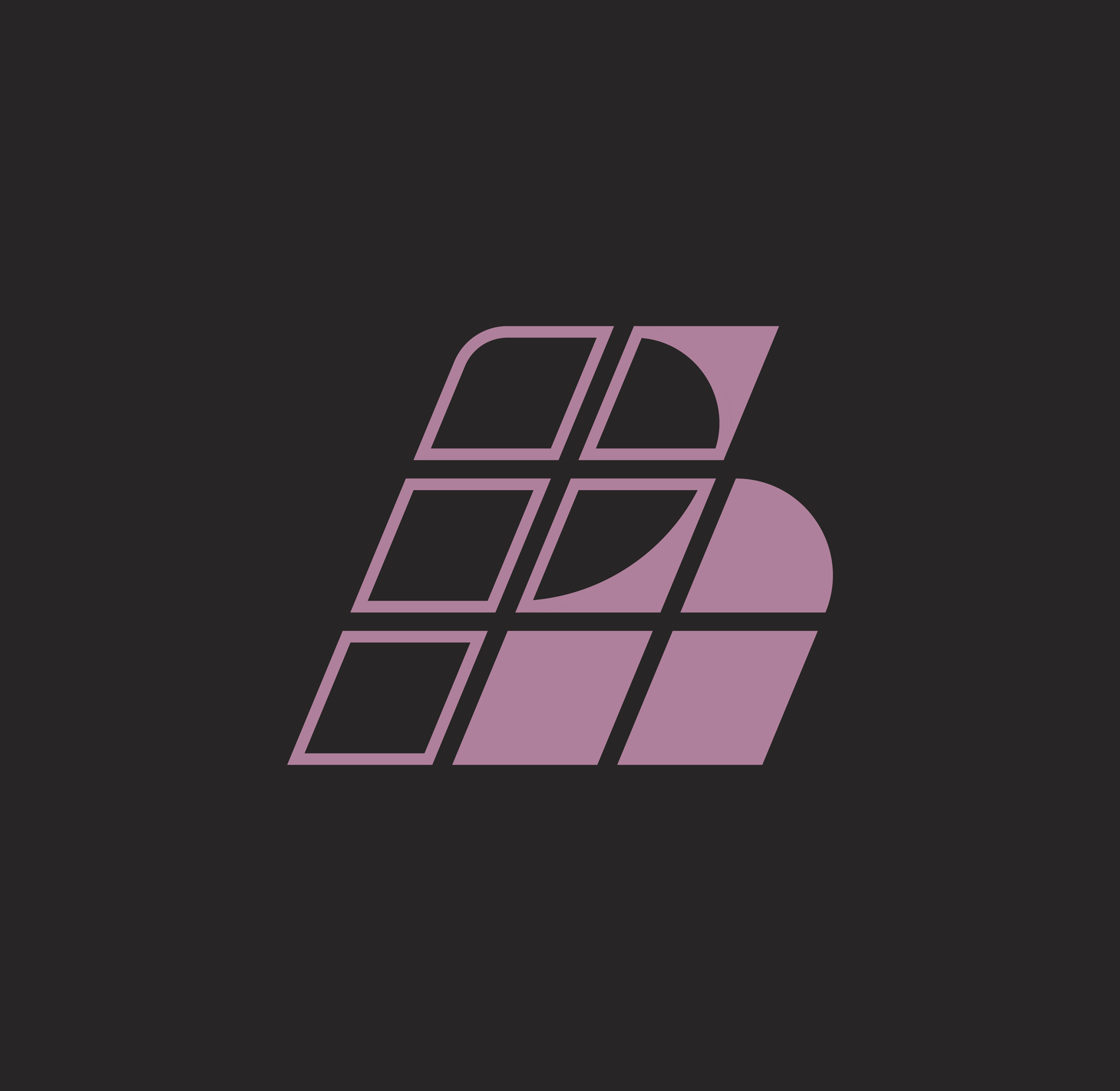
The first stage then led to a drastically altered design with a similar premice. A roof made up of squares to symbolise tiles and again a 3D effect to create depth. This time incorporating the letter 'P' into the design to create an even more independent version of the logo.
After some deliberation I decided that the logo, after the second stage, appeared as 'PA' and therefore didn't work for me. Leading me to remove some of the shapes on the right side and add 2 more in a different position. By remving the colour fill from the left side and filling in some of the exisitng and newly added ones meant that a clear 'P' and a clear 'h' could be seen.