 WORK
ABOUT
EMAIL
WORK
ABOUT
EMAIL

The client asked for a logo design that fits in with the construction market but that stands out at the same time. A text based logo with an icon integrated within it to help deliver their key message which in this case was 'time saving'. They also desired it to be a bold, masculine and modern style that needs to be used on apparel and vehicles, so versalility was key to the design.


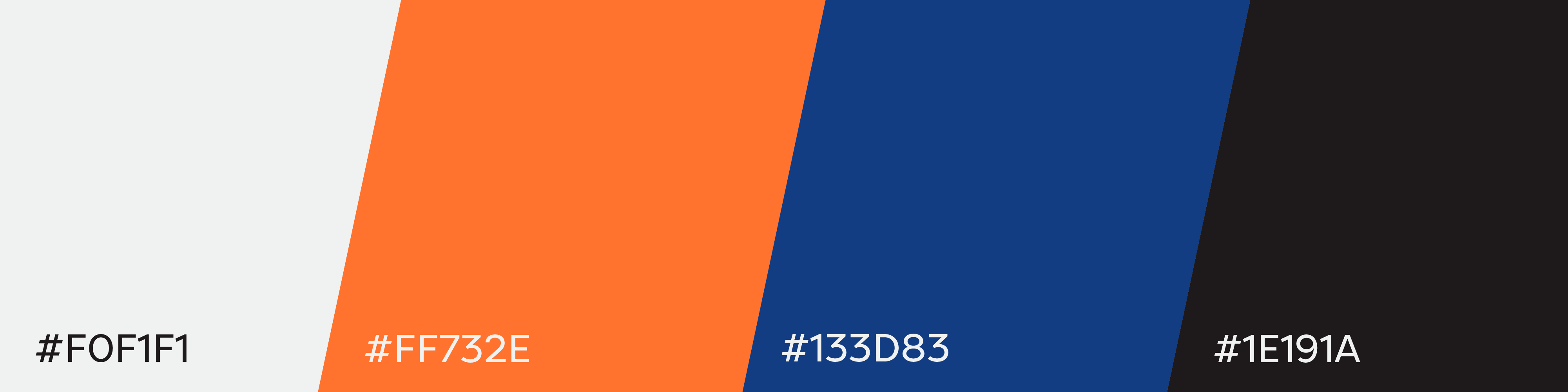
Orange and navy blue was the clients desired colour scheme. Using these colours as two solids made the design look cheap and basic, because of this a gradient was used, resulting in a complementary purple colour in the fade, creating a modern yet still bold and masculine style. The orange used at the start of the logo creates an almost glowing effect that the client really loved about the design.

Breaking down the anatomy of the logo we have the text that starts off bold and becomes thinner on the second half of the design suggesting a cutting theme. The text has an italic style that subtly gives the impression of speed.
To incorporate an icon into the text meant simple but effective imagery, in this case a fast forward symbol was integrated into the 'D' without taking away from the eligibilty.
Finally a simple shape was added to the end of the design that with the use of stroke diameter creates a 3D effect of a hole - which is the main feature of the product.