 WORK
ABOUT
EMAIL
WORK
ABOUT
EMAIL
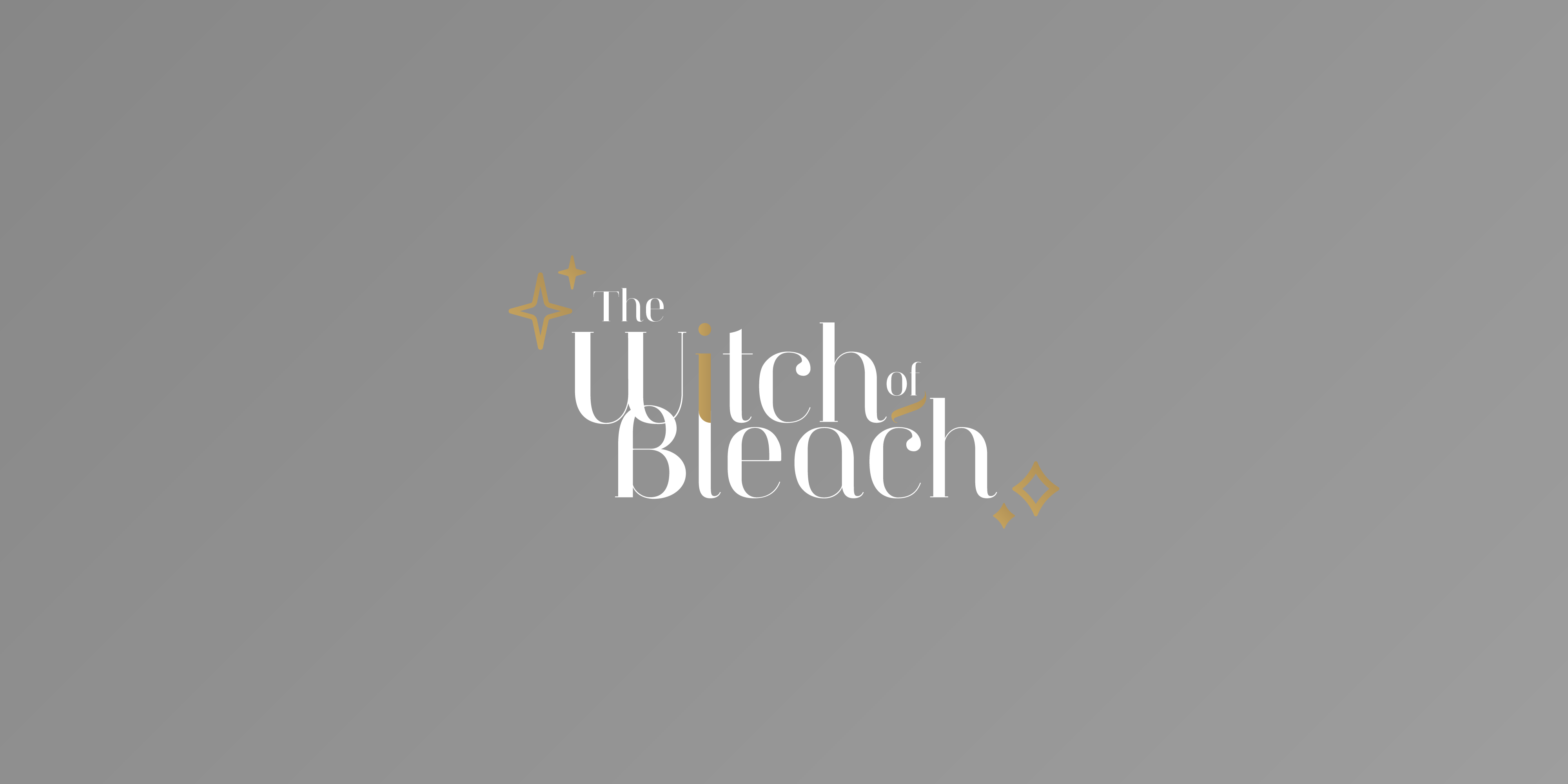
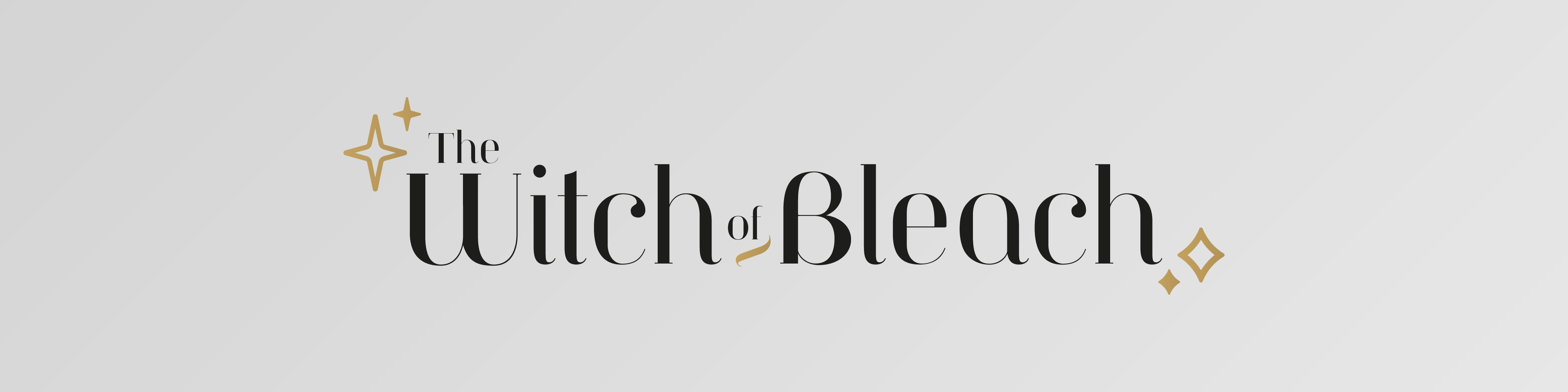
Deciding on the typeface that would be used for the logo and subsiquent 'call to action' features throughout the identity was the first step. A style that portrayed the luxurious and elegant character of the brand with a hint of magic.
A curved typeface was chosen to provide a soft feel but with a sturdy stem and serif, combined to give the impression of a delicate but also trustworthy typeface. The link between the 'W' and the 'B' allows minimal leading without overcrowding.
Finally the little whisp under 'of' in an accent colour and the joining on the letters 'i' and 'l', with a change in colour, to show a clear distinction between the two letters - used for a small and delicate tie to the name and industry.
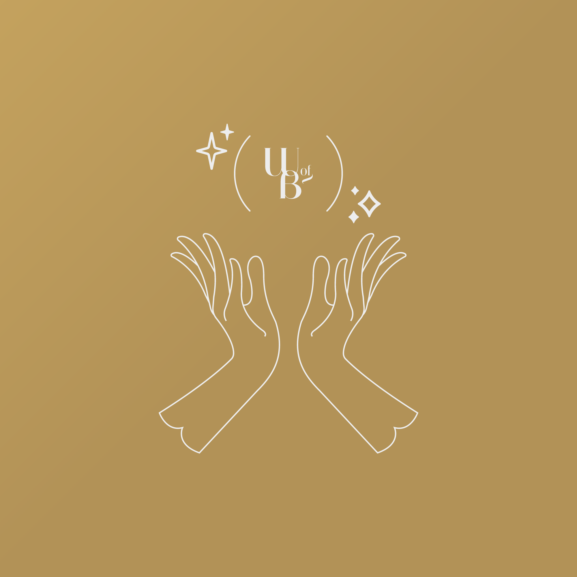

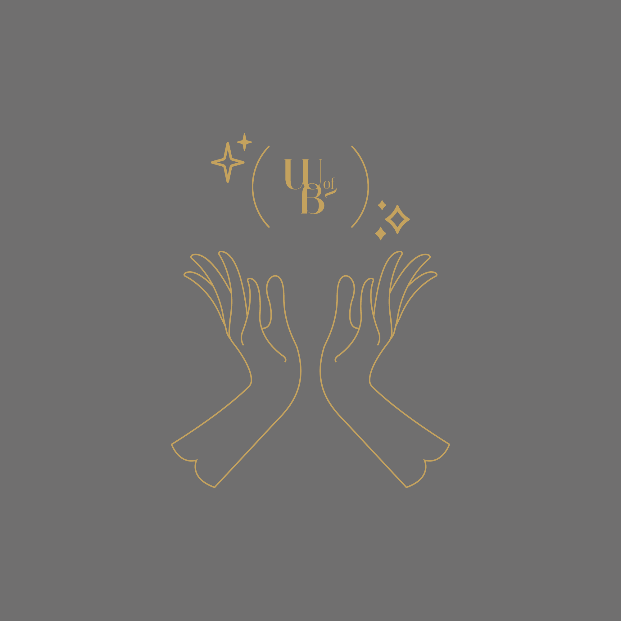

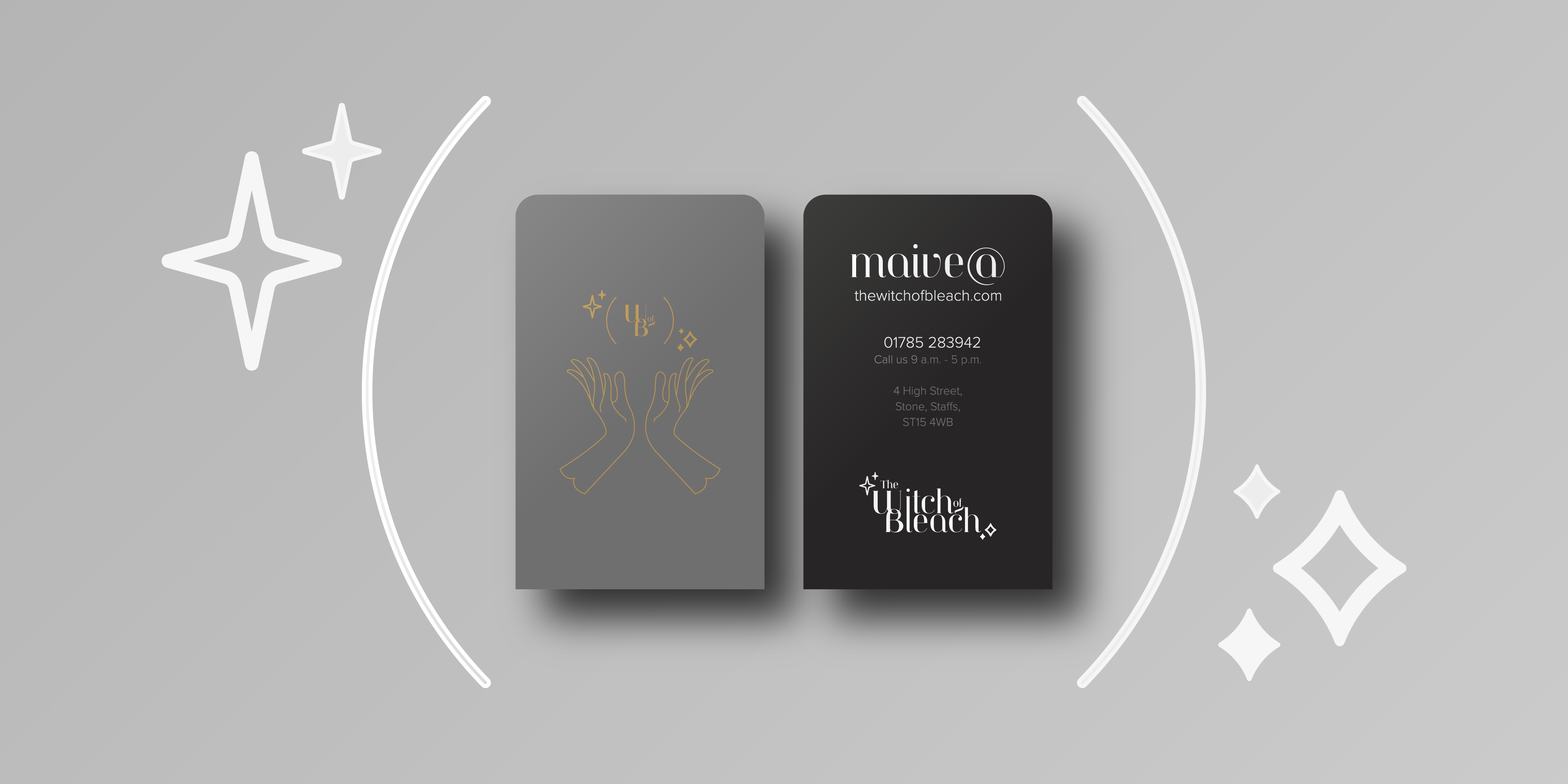
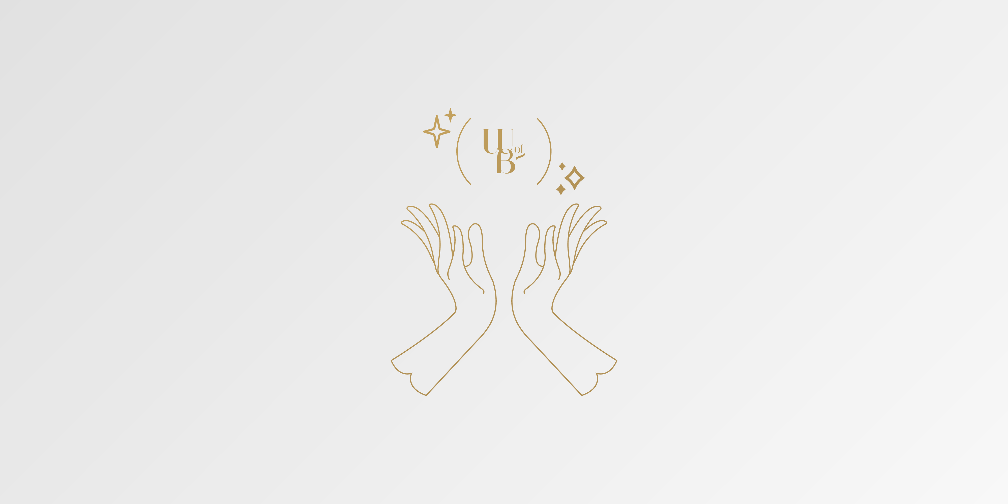
The identity for this hairdresser and stylist needed to come across as luxurious, elegant and magical - as to appeal to potential clients. To fit in with the unique and interesting title meant creating a logo mark that was just as unique and interesting compared to other businesses in the same industry.
Adding some stars to the main logomark was the simplest form when it came to suggesting a magical experience. Another main and important part of the logo is the hands. Used here to depict a magical gesture or spell but also one of a hairstylist most used tools - their hands.
To incorporate a magical note into the design was the next step. It needed to be minimal but precise at the same time to give a clear and concise message to the audience. The client was a young and modern hairstylist so this was a clear suggestion to the type of demographic.